Guided carrier selection
Project overview
Industry
Third-party logistics
Role
User experience designer
Background
For many small businesses, shipping their products can be confusing. Despite our company’s self-service website, many small business employees or owners frequently call customer service representatives to help them feel confident in their shipping choices. Customers particularly look for guidance when selecting their carrier (or trucking) company to get their product from A to B.
Goal
Help our customers choose a carrier confidently through our digital experience
Intended outcome
Reduce the number of small business calls to a customer service representative asking for help selecting a carrier
Process
Initial Research
Before this project, the original website for small business shipping underwent rigorous research. The in-house UX team gathered analytics and observed various customers using the site. The company also paid a consulting agency to perform an additional audit of the site for an unbiased opinion. Numerous usability issues such as findability, surprise charges, lack of credit card functionality, and confusing terminology came up in both research sets.
Our team took these research findings and built an initial user journey around the most critical pain points. We rallied around the journey map by focusing on the pain points each sprint. I verified our progress by testing new prototypes with customers in our lab and watching them use our new tools. We built a brand new website in six months.
This project picks up after this initial release.
JOURNEY MAPPING
I gathered feedback from our site surveys, prototype testing from the past six months, and phone calls with customers using our product live. I shared the findings with the design team, and together we re-drew our journey map line.
Once re-drawn, I worked with our business stakeholders and technical lead to prioritize the features we will work on next. I used the journey map to illustrate our member pain points and the features that would address them. After presenting the updated journey map, we began to rank our features. Each feature received a customer, business, and technical feasibility score. This score helped us determine what to work on next. In this case, it was building functionality to guide our customers as they select a carrier.
The journey map we used to slate this feature for work
Research synthesis
The research I grabbed for the journey map was very broad, so I decided to go back and get a deep dive on comments for this specific feature. I pulled any information I could find on this topic from analytics, surveys, prototype testing, and the initial research before we built the new site. I also worked with our business analysts and architects to understand what was technically feasible.
Customer service interviews
At this point in time, it was clear we had a wealth of research from our customers on this topic. However, we didn't know anything about why our customer services representatives choose one carrier over another. So, I decided to break UX conventions and interview our customer service representatives instead of actual site users. My goal was to understand what the business thinks is important when choosing a carrier, so we can reflect that in our designs. A happy consequence of this choice was our developers had a clear picture of how to build our suggestion algorithm.
Brainstorming
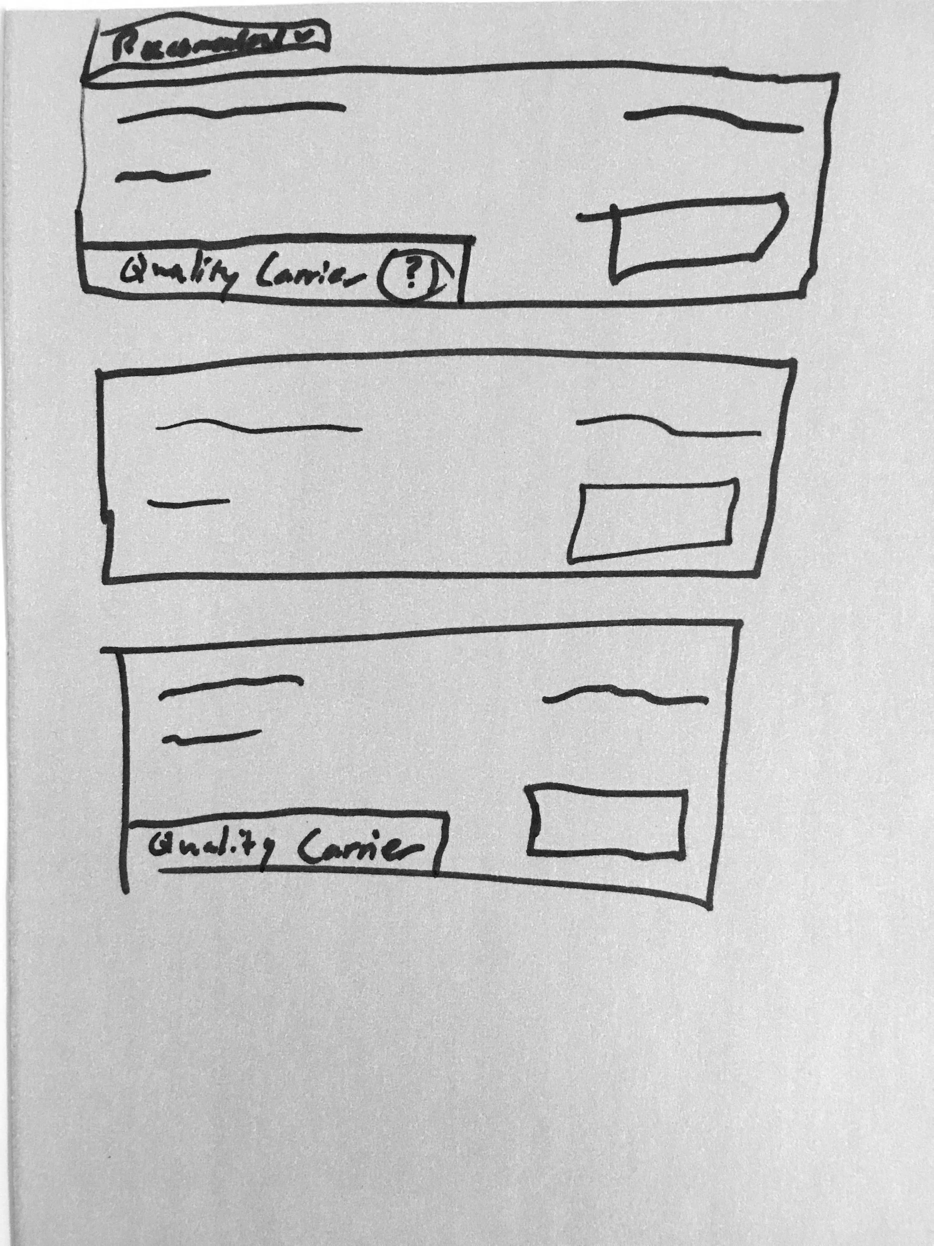
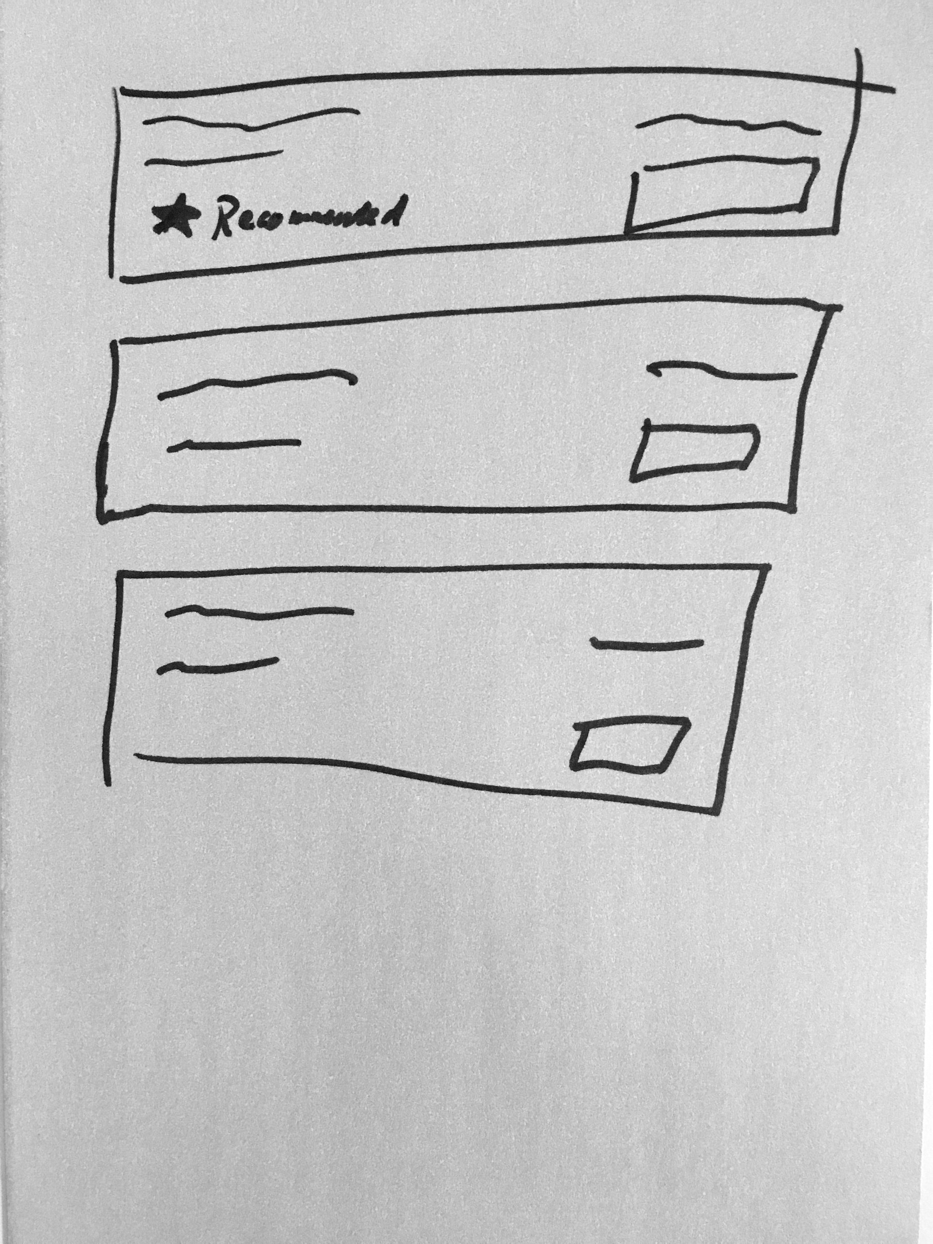
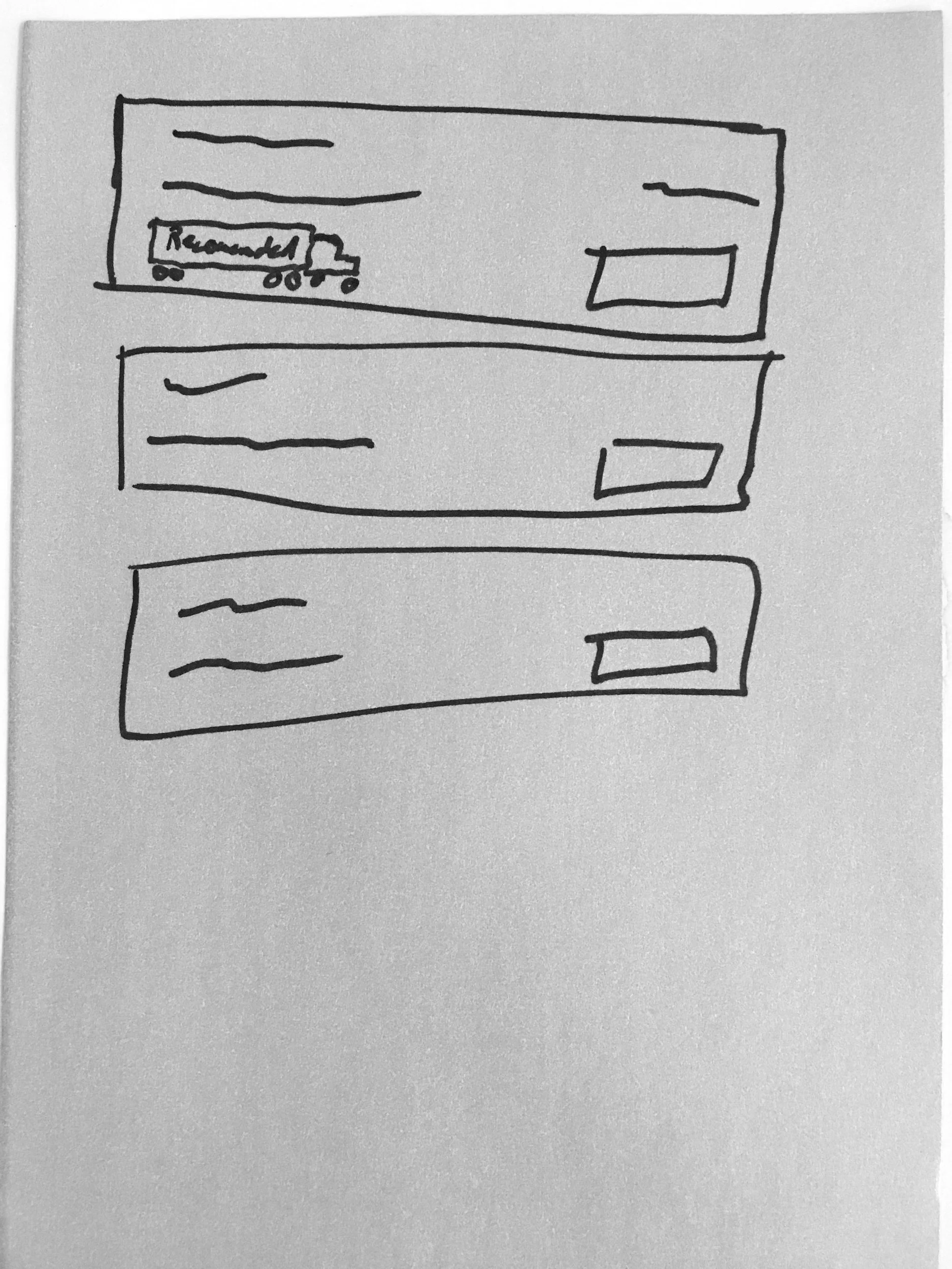
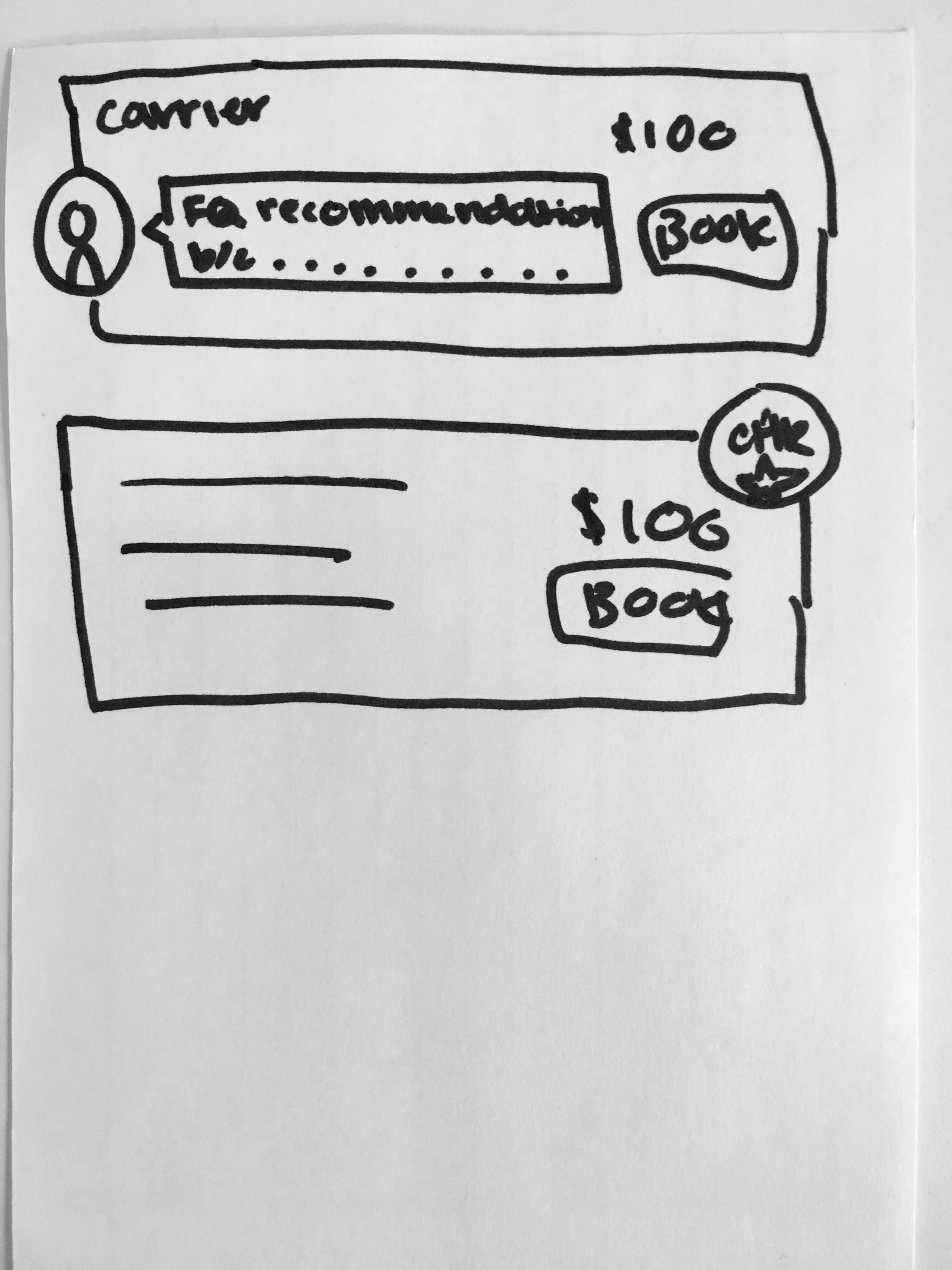
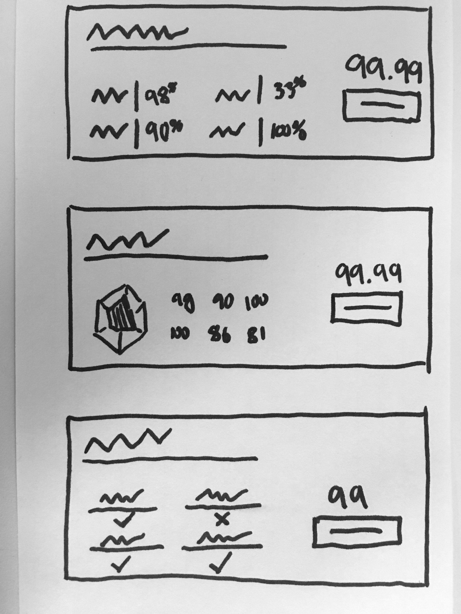
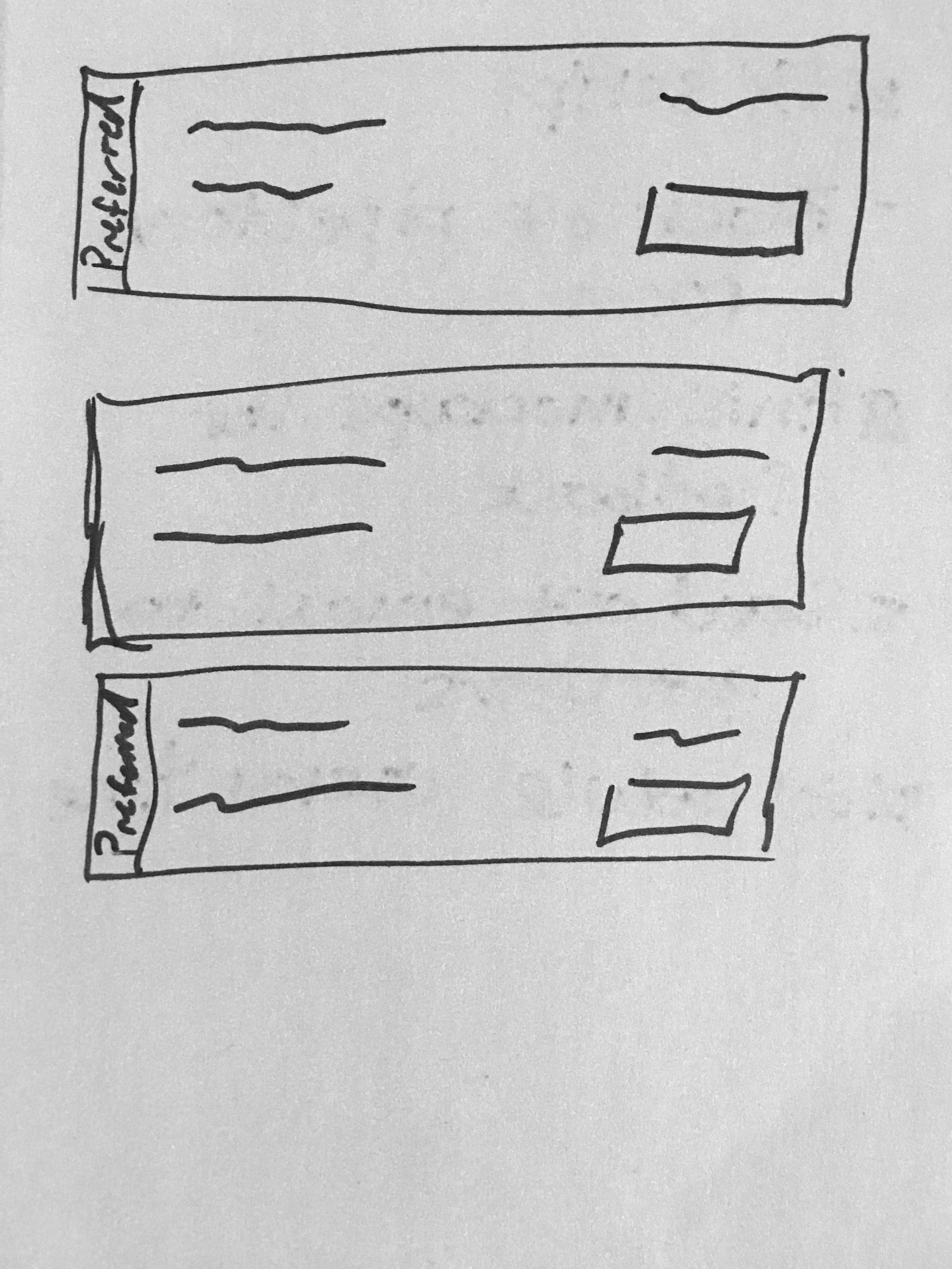
Taking all the information I gathered from past research and customer service interviews, I lead a collaborative brainstorming session (Crazy 8s) with the design team. My goal was to come up with as many ideas as we could that would solve this problem for our customers and narrow it down to our favorites for prototyping. See sketches from the brainstorming session below.
prototyping
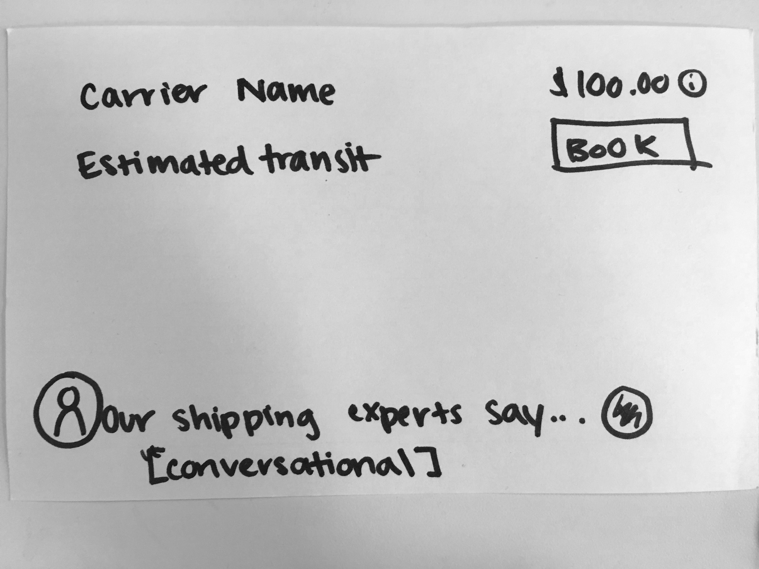
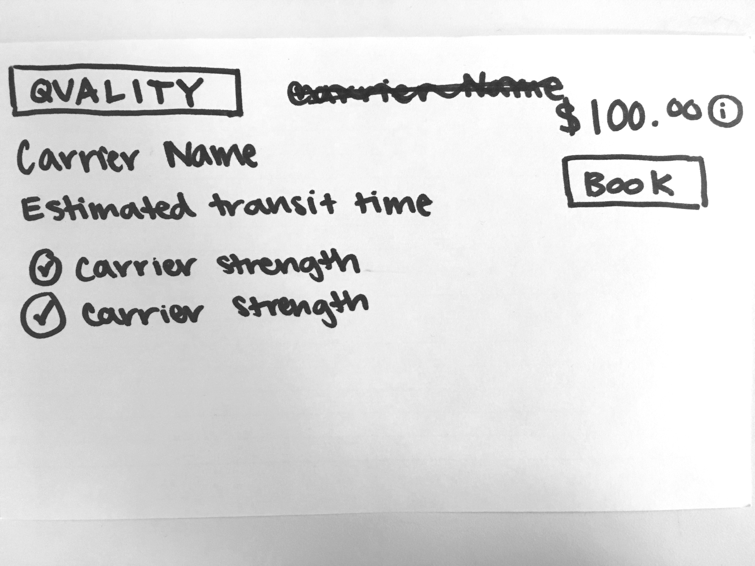
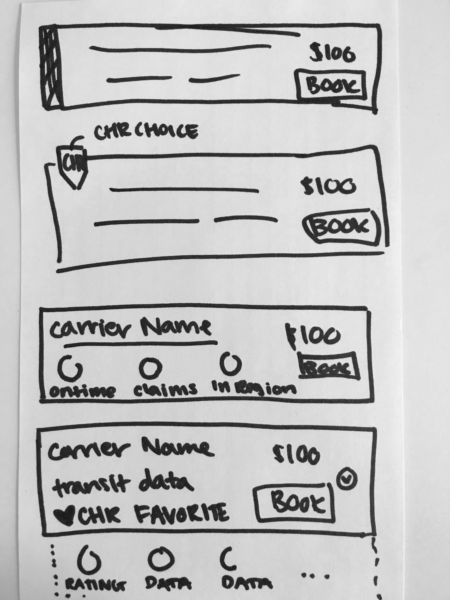
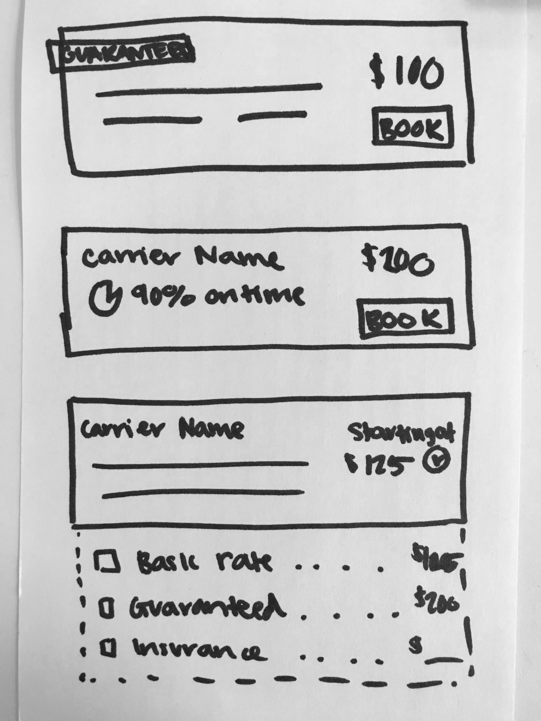
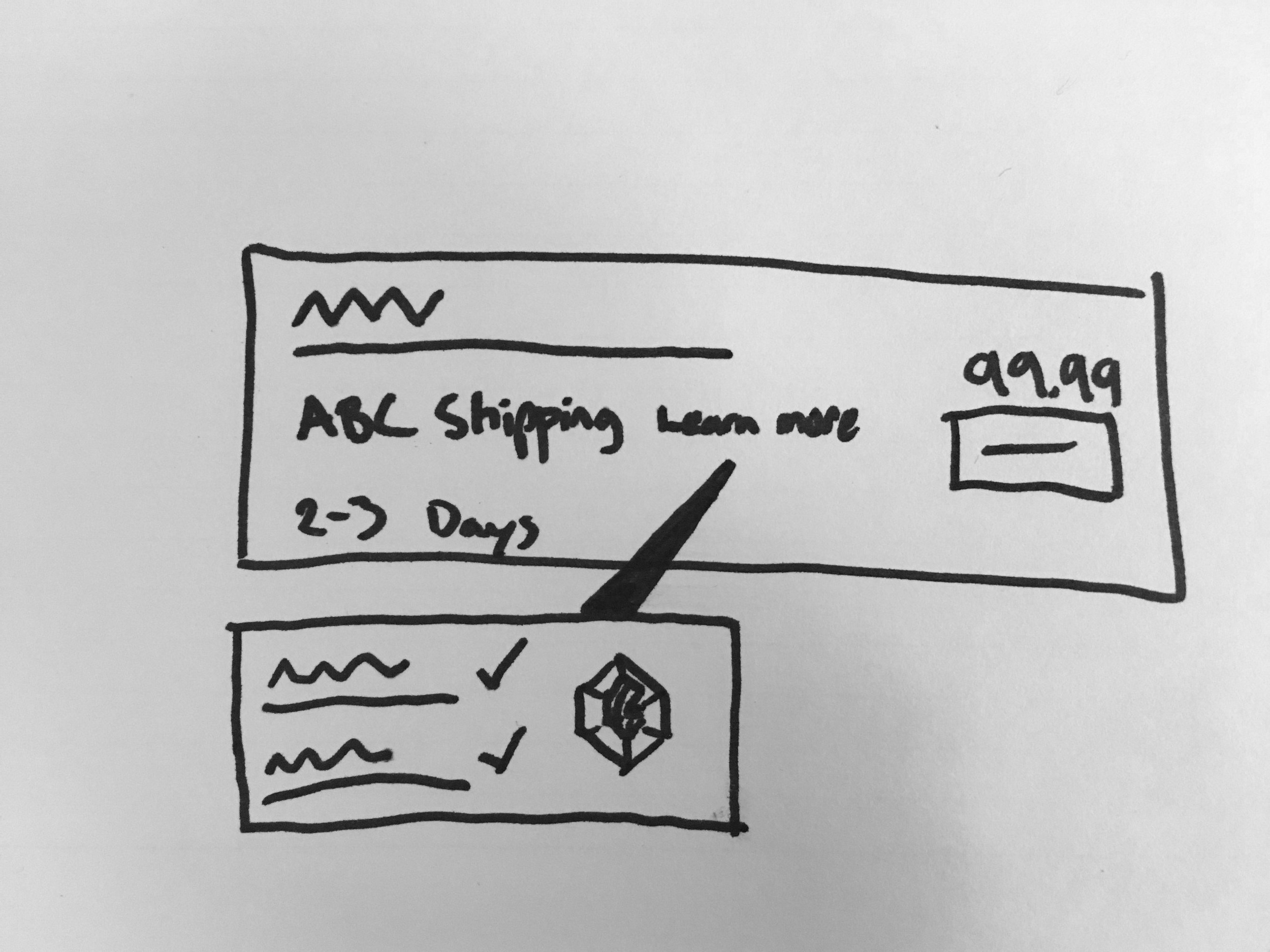
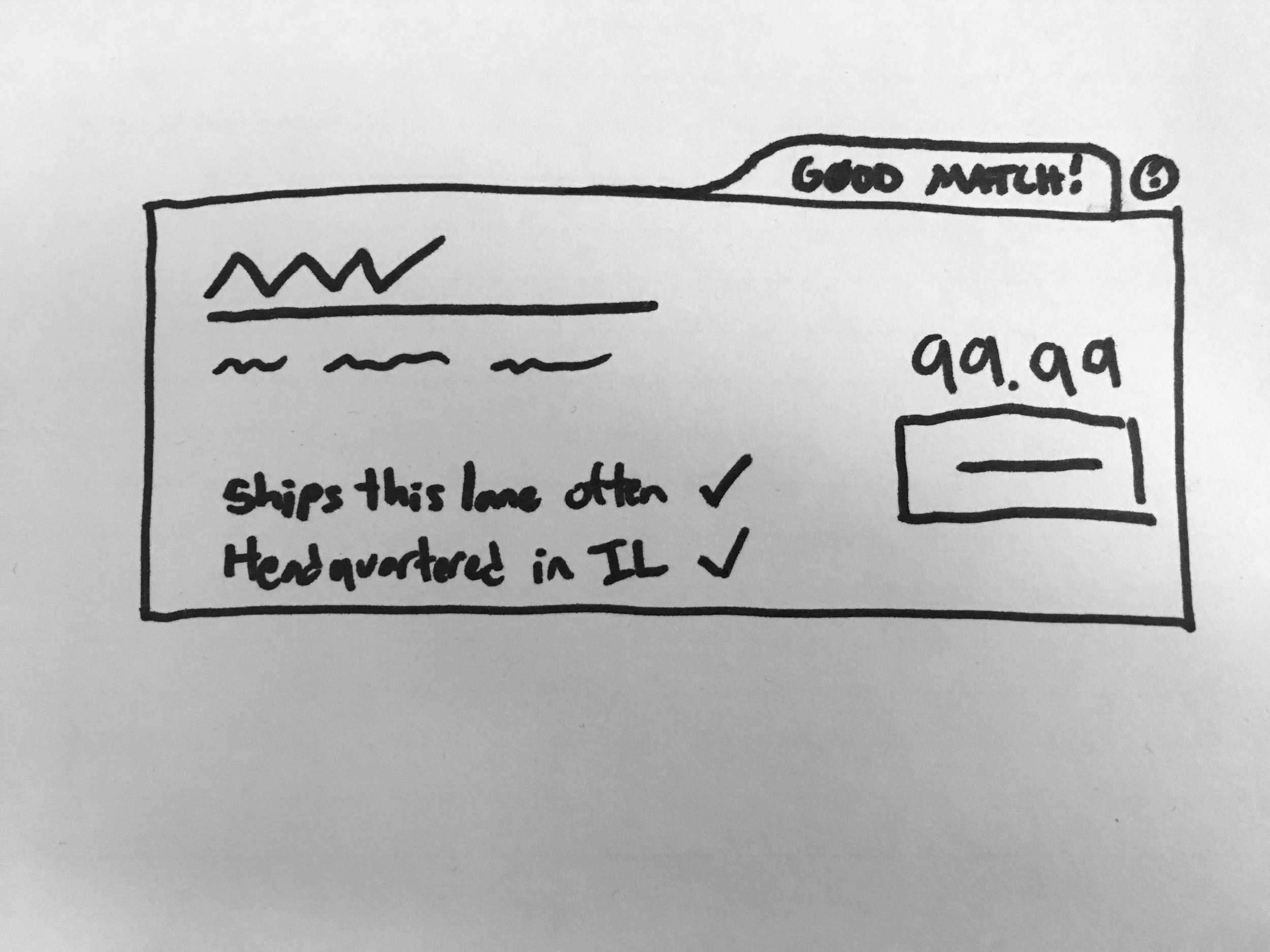
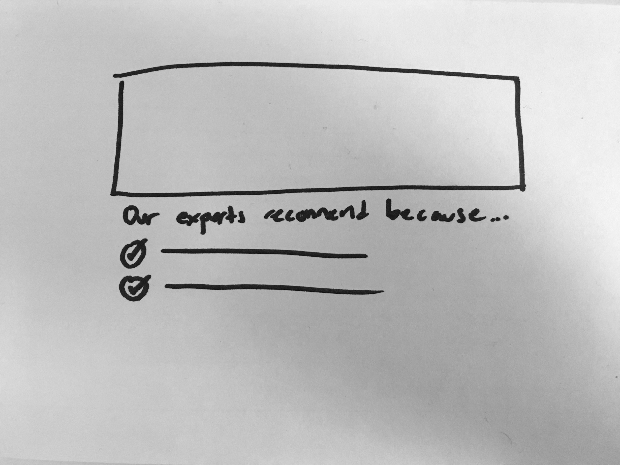
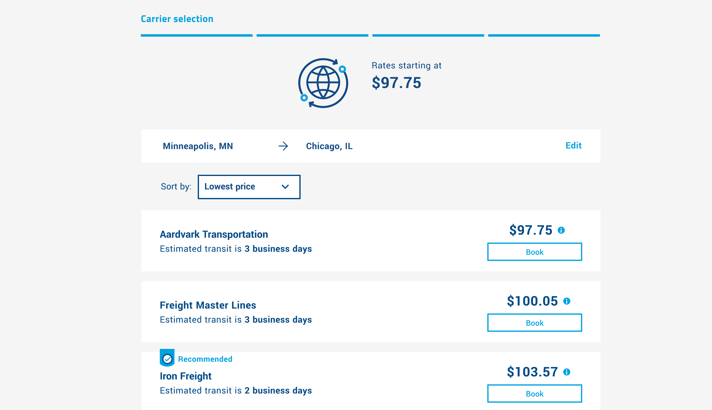
I took the most popular ideas from brainstorming and created two contrasting designs to test. I wanted to understand how users would react to having a carrier recommended by our system using a simple badge (Prototype A) versus detailed, natural language (Prototype B). Throughout the design process, I consulted fellow designers, business analysts, and technical leads for feedback.

prototype testing
I recruited, scheduled, and lead prototype testing with 7 different customers. I built a test scenario and script to use during the session. Customers used each prototype to try and accomplish the scenario task, providing generic feedback at the end.
Results
Overall, customers were excited to see this feature. Many would pick the recommended carrier, even if it was more expensive. Most didn’t feel a lengthy, personalized explanation was necessary but felt it was nice if they wanted to see it. One person was confused at why we would show all the carriers at all if we are already providing suggestions. However, since this didn't come up again, we felt it was something to keep in mind but was not a deal-breaker for the feature. We moved forward with a hybrid approach: the badge from A with a tooltip to explain our reasoning in a user-friendly manner.
Personal takeaways
What I’m proud of
I’m proud of how I was able to bring the voice of many roles (customer service, design, business, and tech) into the product to solve a clear pain point of our customer. This product has taken many steps forward towards agile, LEAN UX and I love checking back in to see what they have added.
What I would do differently
The price points I used in my prototypes were close in numerical value. I would have tested the recommendations with a larger difference in price point. I am still curious about what customers would think if the suggested carrier was significantly more expensive than the cheapest option.
The next project is password protected.